100% compliant
Yoti

Executive summary
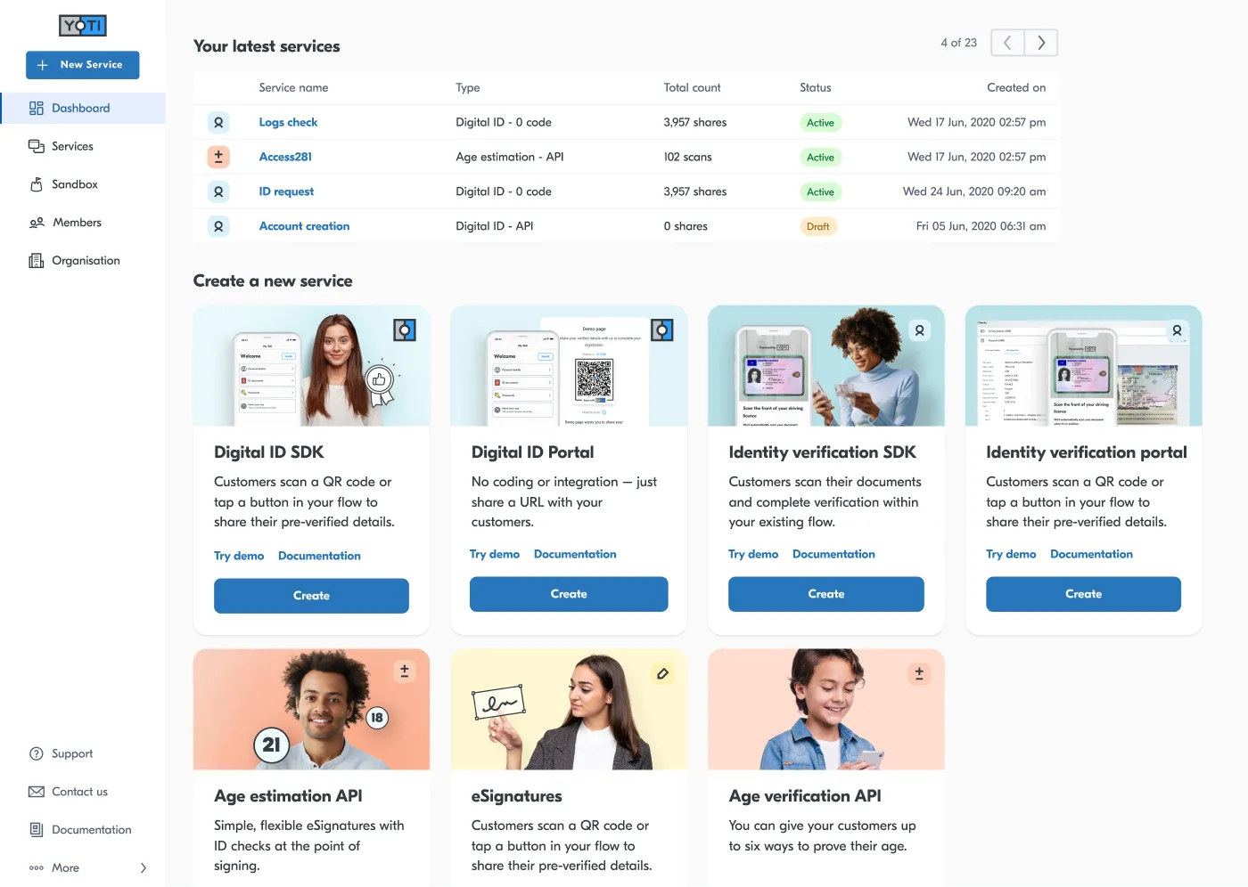
- The challenge: Yoti had scaled to 10+ distinct B2B and B2B2C products, but the design infrastructure was fragmented. White-labeling for high-value enterprise clients required weeks of manual developer intervention, creating a critical bottleneck in the sales cycle.
- The context: I operated within a 15-person design team, balancing a dual role: embedded lead for a product squad and the primary architect for the organization-wide Design System.
- The constraints: We faced massive technical debt in legacy codebases, strict security requirements for Digital ID compliance, and a need to maintain squad velocity while overhauling the core infrastructure.
- The outcome: We transitioned from a manual “service bureau” model to a scalable product platform using Design Tokens. This enabled rapid client customization without engineering overhead.
Erased
The philosophy
“Systems scale; pixel-pushing doesn’t. We needed to treat design as code.”
To move from a startup to a platform, we had to stop designing screens and start designing the logic that generates them.
Exploration: The architectural pivot
We didn’t just jump to a visual redesign. I led an audit of our entire delivery pipeline to identify why client onboarding was stalling. We explored three architectural paths:
- Maintaining separate code branches for each client (unmaintainable).
- Runtime CSS overrides (performance risks).
- A unified logic layer (The Winner).
Unblocking the process via workshops
I facilitated a series of cross-functional workshops with Engineering and Product to map the “cost of change.” We discovered that a simple brand update cost us 40+ engineering hours per client. These sessions were critical in aligning stakeholders on a middleware solution—Design Tokens—to decouple brand decisions from code implementation.
Fixing foundations
Implementing this system required a strategic trade-off. I had to convince stakeholders to pause high-velocity feature shipping to address massive technical debt. This was a friction point.
I positioned the accessibility revamp not just as “good design,” but as a blocker for market entry. I demonstrated that our existing color system failed WCAG compliance, legally disqualifying us from government and banking contracts. By framing design debt as a commercial risk, I secured the resources to rewrite the core system logic.
The solution: Infrastructure as design
I directed the implementation of Design Tokens at an organizational level. We architected a system where design decisions (branding, spacing, typography) were stored as platform-agnostic data (JSON). This allowed us to update a client’s brand definition in one place and propagate it instantly to all product codebases.
The judgment behind the system
The system’s success relied on semantic precision. We moved away from descriptive naming (blue-600, dark-grey) to intent-based naming (action-primary, surface-critical). This required strict judgment on what defined a “brand” versus what defined a “system.”
I enforced a constrained palette that prioritized clarity over variety. We stripped away 50+ redundant grey values and standardized interaction states. The “taste” here wasn’t about making it pretty; it was about creating a rigid logic that prevented engineers from guessing. A button looked correct not because a designer checked it, but because the system made it impossible to look wrong.

Designing for the developer experience
The execution quality ‘the polish’ was measured by developer adoption. A design system is a product served to engineers. I focused heavily on the “API” of our design.
- Documentation: We didn’t just hand off Figma files; we automated the generation of documentation directly from the token set.
- Accessibility First: We baked WCAG AA compliance into the token logic. If a client selected a brand color with insufficient contrast, the system automatically flagged it before deployment.
- Legacy Cleanup: We used this rollout to systematically hunt down and replace hard-coded values, effectively “refactoring” the design across 10+ active products.
The impact & outcome
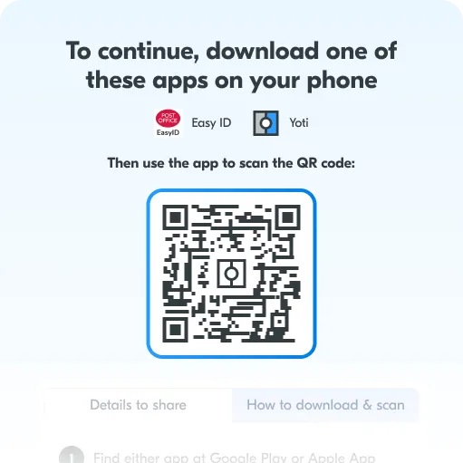
The token architecture became the single source of truth for the organization. By proving we could “skin” our Digital ID app for a major partner like the Post Office in days rather than months, we removed the primary friction in the sales cycle.
Operational Growth: The success of this systematic approach allowed me to mentor other designers within our 15-person team, shifting the culture from individual contribution to systems thinking and operational efficiency.

In retrospect
What stuck: The semantic token layer remains the standard. It successfully bridged the gap between design and engineering.
What I’d do differently: I would have invested earlier in automated regression testing for the visual layer. While the tokens were correct, legacy CSS conflicts occasionally required manual QA, which slightly diminished the speed gains in the early phases.
This experience, as challenging as it could be sometimes, gave me the incredible opportunity to skill up and lead a new way of implementating scalable Design tokens, I even gave a talk at Sunnytech about it.